Indie Red
Indie Red
About the project
Year :
2025Framing:
UnframedMedium:
Mixed media on canvasStyle:
Mandala / Geometric Abstract ArtCategory
Indie Red
A Journey from the Centre Outward
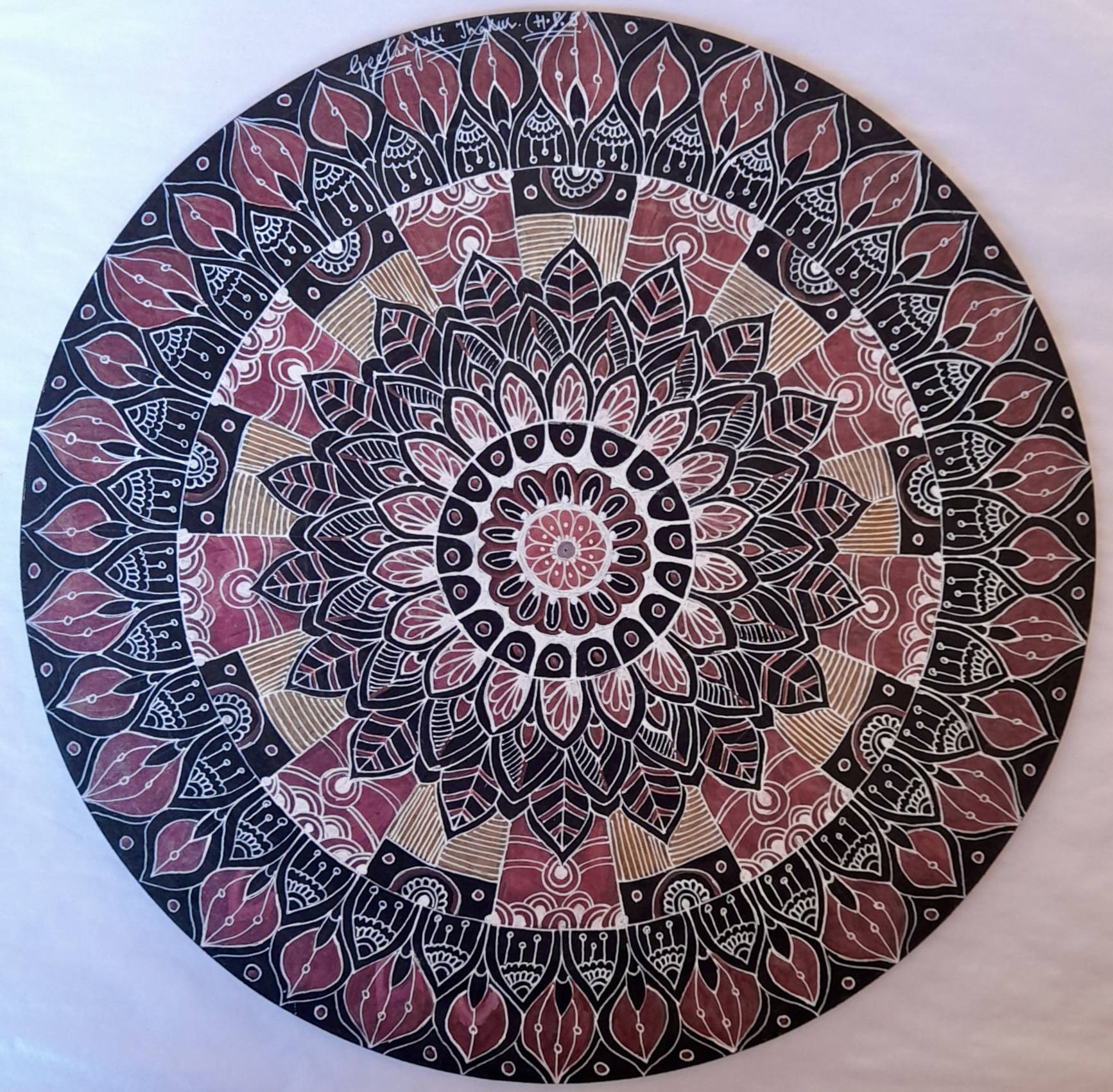
Indie Red is a hand-drawn Mandala that celebrates the beauty of growth, individuality and the quiet strength found within oneself. Built through layers of intricate floral and leaf-inspired motifs, the artwork combines the meditative geometry of traditional Mandala art with a warm, earthy palette of deep red, black, white and muted gold.
The word mandala comes from Sanskrit, meaning “circle.” Traditionally, Mandalas are created around a central point, with patterns radiating outward in balance and symmetry. The process itself can be meditative, requiring patience, concentration and a willingness to allow the artwork to evolve one detail at a time.
In Indie Red, this circular form becomes a metaphor for life itself.
The Story Behind the Painting
The story begins with the small flower at the very centre.
It represents the inner self, the part of us that exists before the world begins to shape our choices, experiences and identities. From this delicate centre, the Mandala gradually unfolds into larger petals, leaves and increasingly complex patterns.
Each layer can be seen as a different chapter of life. Some are bold and defined, while others are delicate and intricately detailed. Together, they represent the experiences that gradually shape who we become.
The repeated leaf forms create a particularly strong sense of growth. Just as leaves emerge, change and renew themselves, they symbolise the ability to evolve while remaining connected to one’s roots.
As the design expands outward, it becomes richer and more elaborate, yet the original centre remains visible. It is a reminder that growth does not require us to lose our identity. Instead, every experience can become another layer of it.
The Language of Colour
The colour palette gives Indie Red much of its character.
The deep, earthy reds bring warmth, courage and vitality to the composition. Black introduces strength and depth, while the fine white detailing brings clarity to even the most intricate areas. Touches of muted gold and brown soften the contrast and lend the artwork an organic, grounded quality.
Rather than relying on bright colour, the painting finds its energy through contrast, repetition and detail, giving it a character that feels both contemporary and rooted in tradition.

About the project
Year: 2025
Medium: Mixed media on canvas
Style: Mandala / Geometric Abstract Art
Framing: Unframed
Category
Evil Eye
Visual Breakdown
- Composition & Focal Point:A perfectly symmetrical, circular mandala inspired by the traditional Evil Eye protection symbol. A bold, solid black pupil sits at the absolute center, enclosed by smooth, concentric rings of vibrant cobalt blue, sky blue, and crisp white.
- Color Palette: A striking combination of deep sapphire blue, electric blue, stark white, and jet black, creating a high-contrast, mesmerizing visual effect.
- Texture & Technique:Highly detailed line work forms intricate floral and petal-like motifs that radiate outward in repeating, delicate bands. Clean geometric borders divide the intricate ink-like patterns from the smooth color-blocked rings.
- Details & Signature: Signed in delicate script along the bottom left inner band (Geetanjali Thakur...).
Evil Eye fuses symbolic protection imagery with intricate mandala geometry, using intense blues and detailed penwork to create a hypnotic, meditative centerpiece.
The Artist’s Vision
The artist envisioned Indie Red as a celebration of individuality within harmony.
Although a Mandala is governed by symmetry, no viewer experiences it in exactly the same way. The eye may first be drawn to the centre, the bold black leaves, the red outer petals or perhaps one of the smallest hand-drawn details hidden within the larger composition.
That individuality of perception lies at the heart of the work.
The artist’s vision was to create something that feels structured without feeling rigid, intricate without becoming chaotic, and powerful while retaining a sense of calm. Every line and repeated motif contributes to the whole, reflecting the idea that the person we become is shaped by countless seemingly small experiences.
Ultimately, Indie Red is a visual journey of becoming. It begins quietly at the centre and grows confidently outward, carrying its origins with it through every layer.
A reminder that we can continue to grow, change and unfold, without ever losing the centre from which we began.